Turia - Typography & Art Direction
Turia explores the innovative architecture of the Museu de les Ciencies Principe Filipo, in Valencia. The typeface is inspired by the asymmetrical interpretation of the building with a futuristic edge, used in large scale wayfindings.
Circularity - Branding & System Design
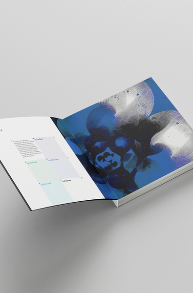
Circularity is born as a system design exploring with mundane circular objects to create innovative visuals based on the system. Circularity it is also a branded workshop which delivers step by step what to do sustained by Circularity book & website. https://ocircularityo.cargo.site/
Link - Editorial & Screenprints
Link is an A5 booklet that explores with layout and typography the idea of why in the Western culinary culture there are recurring pair of words such Knife & Fork, Table & Chair, Salt & Pepper and Pots & Pans.
View. - Branding & App
View. is an experience for visitors placed in the Toast Rack Building in Manchester. View. is a Film Museum where the aspect ratio of the camera is celebrated throughout the usage of frames that hide and reveal the content beneath. The app releases snaps of new up coming exhibitions and be able to book tickets.
Colourplan - Vinyl Cover & Motion
This vinyl covered is inspired by the idea of being lost and fluctuating in a dark field surrounded by iridescent and blurry swarm of fireflies which symbolises the light that drives us out of dark. The association with the Colourplan paper range of G.F. Smith rely within the fact that colours exists because there is light. The vinyl celebrates the collaboration between G.F. Smith and Father in their launch to the Portal, 55 colours shades paper by G.F. Smith associated with bespoke tracks by Father.
Little Brown Books Group - Covers
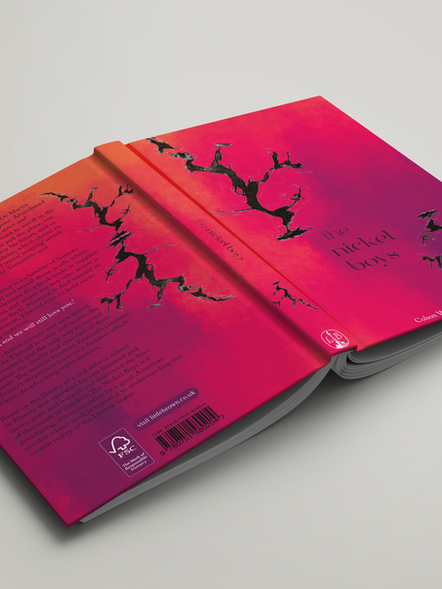
Three book covers, One theme in common, Time.
These covers explore the theme of time through Scanography technique. The raw materials gathered for each of the genre were related to one of the climax moment of the narrative and then edited to pursuit a wider audience that usually wouldn't buy that genre. The colours in fact are targeting the wider audience which are not immediately associated with the genre.


